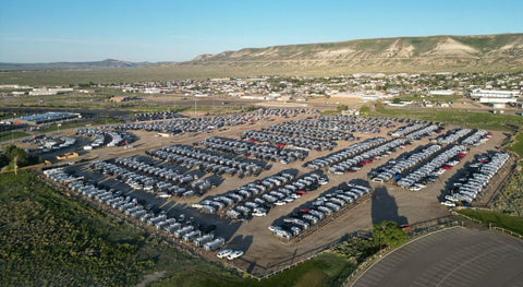
This month my husband and I concluded a five-week camping tour of New York State from Niagara Falls to Manhattan. We were on a guided adventure along with twenty other Airstream couples. Pictured above are three of our trailers, camped at Bethel Woods (site of the 1969 Woodstock Festival).
We had a wonderful time getting to know everyone on the trip, and enjoyed a wide variety of interesting and educational excursions together. But this post is not about our itinerary.
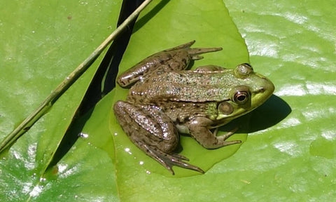
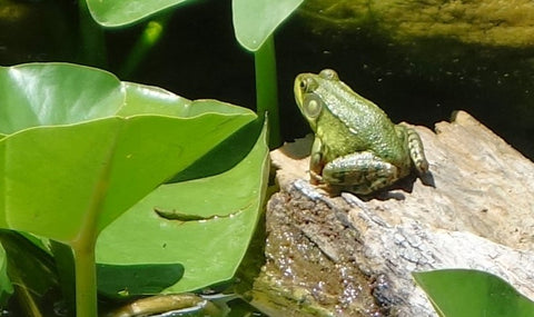
Instead, I am sharing with you my top twenty photos from our trip, from my perspective as an artist. These photos will provide unique inspiration for future paintings.

I did not expect to find a hot air balloon flying over our beautiful camping spot near Syracuse, but I can see this idea enriching a composition.

Even though I knew the Canadian Shield extends into New York state, I still was surprised to encounter rugged northern scenery, such as this view from Whiteface Mountain in the Adirondacks.

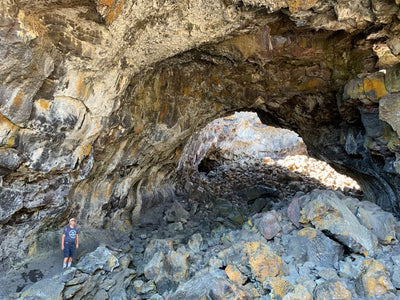
We climbed to the summit of Whiteface Mountain along a challenging trail pictured at the top of this ridge. Lots of great rocks to see here.

From Whiteface Mountain we could see Lake Placid, somewhat obscured by smoke from distant forest fires. Rocks, trees, water... what more is there for my artist's heart to love? The transition from greens to blues in the distance is sublime.

The Hudson River provided several gorgeous views. This one is from West Point Military Academy. What a pretty spot for a university campus and army post!

The Finger Lakes region is very reminiscent of Muskoka in northern Ontario. I managed to catch these kayakers enjoying a sunny afternoon on the Saranac River near Lake Placid. I think this has all the elements of a perfect painting.

We stopped for lunch at the exclusive, historic Sagamore Hotel on Lake George. I can see why the hotel was established here in 1883. What a glorious water view it has, looking north.

This is the view from the Sagamore Hotel looking south on Lake George. Absolutely breathtaking. I could have sat there all day drinking in the magnificence of the lake, islands, and ridge.

Speaking of luxury properties, this is one of the lovely views from Kykuit, the Rockefeller weekend getaway estate in Sleepy Hollow. The misty hills in the background speak to my artist's soul.

Sometimes I only use one element from a reference photo in a painting. I can envision the foreground flowers shown here in an entirely different northern scene, such as in front of a marsh or lake. I took this photo at Saratoga National Historic Park and this bucolic countryside was a battlefield during the Revolutionary war.

We saw some impressive waterfalls. This is Niagara Falls seen from the American side.

The waterfalls and dam at New Croton Reservoir near Croton-on-Hudson were very pretty. They were constructed between 1892 and 1906. At time of completion, the dam was the tallest in the world (297 feet or 91m). It is part of the water supply system for New York City.

Seen from the bridge portion of the dam, New Croton Reservoir is really lovely. Those hills and reflections will make a wonderful background for a painting one day.

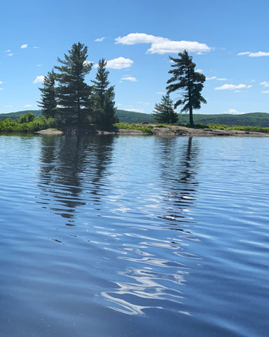
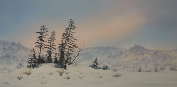
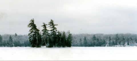
Our cruise of the 1000 Islands provided access to lots of great scenery, including this island I am itching to paint. I like the lighting, the shapes of the rocks, the variety of trees, and the rippled reflection.

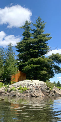
Wherever we travel, I always am on the lookout for majestic pines that tower over the surrounding forest. This pair seen near the 1000 Islands will make a stunning centrepiece in a painting soon.

Another natural feature I look for when we travel is dramatic skies. I happened to glance out of our Airstream early one day at Lake George Escape Campground and saw the sunrise breaking through the morning fog. I was still in my pyjamas but quickly opened our door and snapped a photo. Hopefully our neighbours were still asleep! When I paint this scene I will exclude the trailers at the bottom.

We were enjoying a cruise along the Hudson River near New Paltz when these clouds drifted in front of the sun. The back lighting effect would be hard to achieve in a watercolour painting but I may try it one day.

This view of the Hudson River is from the Walkway on the Hudson, a former railway-bridge-turned-pedestrian-trail near Poughkeepsie. I love the clouds in this scene.

We were treated to this pretty sunset with whispy clouds on the last night of our trip. This reference could be used in a northern lake scene with some spiky evergreens adding interest to the horizon.
I hope you have enjoyed this brief glimpse of our New York state adventure. Perhaps you will have a chance to visit these beautiful destinations in person if your travels take you near these locales. And I hope seeing my photos and reading my thoughts about them gives you an idea of how an artist views the world.
If you have comments you wish to share, please do so using the 'Leave a Comment' button at the top of this post.
Subscribe to Karen's Newsletter if you wish to see more travel tales, painting stories, studio news updates, or notices of upcoming exhibitions.
]]> Last spring, fortunate folks from around the world were privileged to witness spectacular displays of northern lights.


 Twenty years ago, my husband and I spent a sunny August weekend at a lodge on a cluster of tiny islands in Georgian Bay. While kayaking there, I was treated to my first up-close views of the iconic rock of that region of Ontario.
 A Place of the Heart, varnished watercolour on 14 x 11 inch panel, $900.
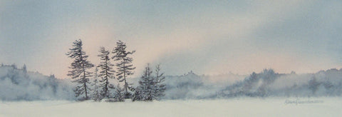
 The Windy Shore, varnished watercolour on 20 x 16 inch panel, $1500.


 If you are like me, whenever this time of year rolls around I yearn to see fresh colour.


 If you have not visited The


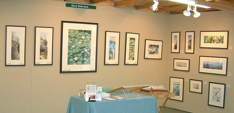 This is a photo of my booth at the 2006 Buckhorn Fine Art Festival, where Enchantment was sold to a collector. It is the tiny painting in the middle of the far right wall. In those days, I was framing my watercolours with mats and glass. Now I mount them on art boards and varnish with a UV blocking coating, eliminating the need for glass. You can read about my framing process in this article:
 This is the third time I have painted this scene, and it resonates so powerfully with me, I feel like I could paint it again sometime in the future. This artwork celebrates all I hold dear about northern scenery: vast skies, clear blue water, smooth stones, and hardy pine and spruce trees.
 She was on a back country camping trip and her party stayed overnight in tents on this beach. She graciously granted me permission to use her stunning sunset photo (shown left) as reference for my artwork.
 In my last post, I told the story behind my painting Yesterday's Dreams, which was inspired by a vintage gas pump we saw on our last trip to Newfoundland.
 My photo of a tree growing from a rocky cliff was taken on the Port au Port peninsula near Stephenville, and my photo of large boulders was from Gros Morne National Park.


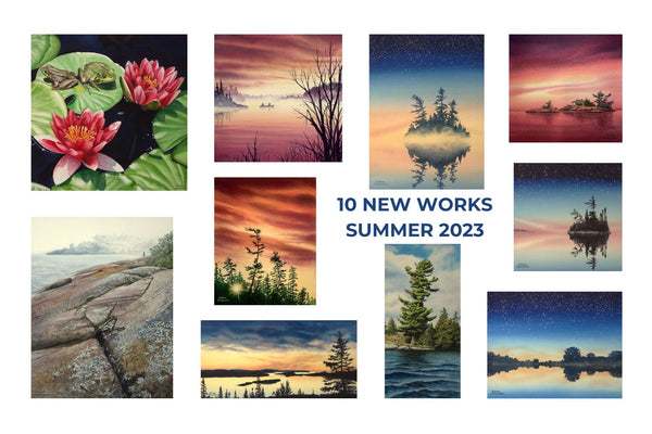


 Over the past winter and spring, I have devoted myself to building a fresh collection of landscape paintings, destined for display and sale at my retail gallery partners.
 Living the Dream, varnished watercolour on 12 x 12 inch panel
 Quality Time, varnished watercolour on 9 x 12 inch panel
 Daybreak, varnished watercolour on 10 x 10 inch panel
 Dancing in the Dark, varnished watercolour on 12 x 12 inch panel
  Steadfast and True, varnished watercolour on 16 x 12 inch panel


 I decided to spend a few months this winter and spring focusing on painting cloudy sunset scenes, to try to determine where I had been going wrong in the past, and figure out what strategies might work better.
 The painting was inspired by this photograph I took of the view from my bedroom window last December. The trees grow in the hedgerow between farm fields behind our house, and every morning I look out my window to absorb the beauty of nature.
 The Wonder of It All, varnished watercolour on 6 x 12 inch panel depicts a glowing sunset over a northern lake. Sometimes I look at a splendid sky and just have to marvel at the artistry of nature. She creates the most marvellous paintings, just using light and water vapour. I am awed by the wonder of it all.
 The painting was inspired by this photo of Six Mile Lake in Muskoka, taken by Sharon Hopkirk and used with her gracious permission.
 I was still entranced by Sharon's gorgeous photo, and started a second attempt at painting the full scene. I took a photo at the end of each day so I could show you the layering process.


 Listen to the Silence, varnished watercolour on 14 x 11 inch panel.
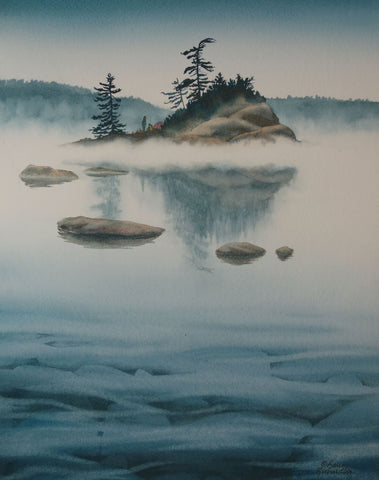

 Reunion, varnished watercolour on 10 x 10 inch panel.
 For this painting, I used her reference photo (shown here) for the foreground and invented a couple of islands to make a more interesting scene. I changed the canoe colours and decided to make the season autumn, so the trees would complement the canoes.
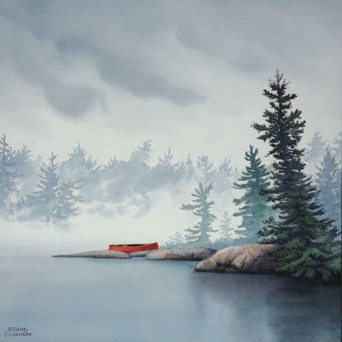

 Some Enchanted Evening, varnished watercolour on 16 x 12 inch panel.
 Maple Flooring, varnished watercolour on 11 x 14 inch panel.