Earthbound Artist

Articles tagged as Painting Classes (view all)

The Superior Paintings Begin

20 November, 2017 2 comments Leave a comment

In my previous post, I told the story of our camping trip to Lake Superior this summer. Although I am in the midst of teaching watercolour techniques to over 50 students this fall, I have carved out some private painting time in my studio, inspired by my Lake Superior trip photos.

Clarity, watercolour 28 x 11" by Karen Richardson

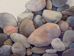
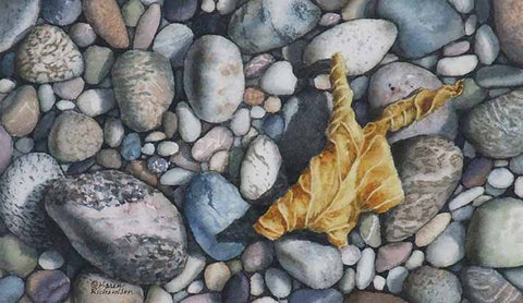
The painting above, Clarity (watercolour, 28 x 11"), was the first major work inspired by this trip. I used several experimental techniques and am excited with the result. The scene depicts a view from the coastal trail near Rossport, on the north shore of Lake Superior. The water is so clear, it becomes almost impossible to tell if rocks are above or below the surface. I'll let you decide.

I made a short time lapse video, showing how this painting grew from start to finish. Click on the arrow below to view:

Click here to see more information about Clarity.

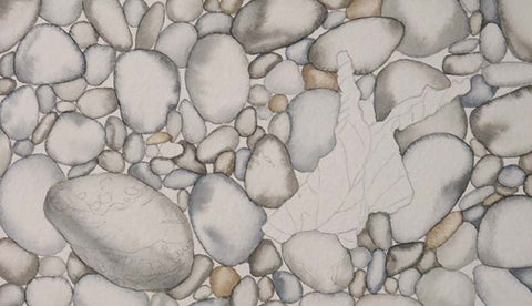
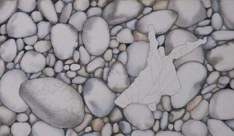
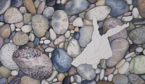
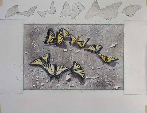
For my second Lake Superior painting, Time to Head South (watercolour 16 x 20") shown below, I was able to combine the activities of teaching and producing a major piece of artwork. I began by drawing the two Monarch butterflies and the autumn leaf in pencil on my watercolour paper. Then I drew in the stone shapes as a background.

Time to Head South, watercolour 16 x 20" by Karen Richardson

During three of my one-day Pebbles 1-2-3 beginner workshops, I used this composition as my demonstration painting. I shaded and coloured the stones, working around the butterfly and leaf shapes. I used my Lake Superior trip photos as inspiration for the specific stone markings.

As with all of my paintings, every colour in the painting was mixed from primary red, blue, and yellow paints. Once the background was finished, after the third workshop, I painted the Monarchs and leaf.

The title, Time to Head South, refers to the annual fall migration of Monarchs, to their winter habitat in the mountains of Mexico. I hope we see lots of their descendants here in Ontario next summer.

These paintings are just the beginning of my Superior collection. I look forward to sharing more of them with you.

If you have comments you wish to share, please do so using the 'Leave a Comment' button at the top of this post. 

Subscribe to Karen's Newsletter for exclusive early access to new work, studio news updates, travel tales, painting tips, and notices of upcoming exhibitions.

SaveSaveSaveSaveSave

The Making of 'Hollyhock and Stone'

15 May, 2017 6 comments Leave a comment

Hollyhock and Stone, watercolour by Karen Richardson

This spring, I taught a 3-day Hollyhock and Stone watercolour class, for intermediate and advanced students. We each chose different reference photos and painted different blossom colours. I chose a pink and burgundy mix (shown above) for my demonstration painting, with a finished size of 16 x 12".

Hollyhock and Stone by Karen Richardson, step 1

We began by drawing our composition on layout paper (using proportional squares to enlarge the photo image), then tracing that drawing onto our 300 lb watercolour paper using graphite transfer paper. Then we masked out the fine veins inside the flowers with masking fluid to preserve the white paper.

For my paints, I wanted to evaluate a new (to me) brand of watercolour paint - Schmincke, which is made in Germany. I chose Helio Blue Reddish, Permanent Carmine, and Gamboge Gum Modern as my three primary colours, and mixed all of the painting colours from these three. I loved the smoothness of this brand, and look forward to doing more paintings with my Schmincke paints.

I find the most successful method for painting plant life is to work up the shadows in gradual layers, and adding a coat of brighter overall colour at the end. When the first shadow layer is dry, the next layer adds deeper colour, just in the darker shadow areas. The photo above shows the flowers after three layers and the green buds and stems after two layers.

Hollyhock and Stone by Karen Richardson, step 2

In the photo above, I have added one more shadow layer on the green buds and stems, followed by a bright green glaze over all the green parts. When this was dry, I painted the cement mortar of the stone wall with a two-tone tan.

Watercolour Workshop taught by Karen Richardson

In the photo above, my students are pictured in my studio, working on their hollyhock compositions. My demonstration painting is at the bottom, and you can see several of my favourite #12 round sable/synthetic brushes beside my painting.

Hollyhock and Stone by Karen Richardson, step 3

Once the mortar sections had dried, I wet each building stone, dropped in two paint colours, and then sprinkled on salt to produce a mineral effect. I used a cool neutral mix (blue-gray), and a warm neutral mix (brown-gray). Once this was fully dry, I brushed off the salt. Then, using a dark gray mixture, I added some shadowy cracks between the mortar sections, and some subtle shadows to make the mortar look less flat.

Hollyhock and Stone by Karen Richardson, step 4

In the photo above, I have added shadows across the faces of the stones, using a charcoal gray-black (mixed from the primaries), and added more shadow details to the mortar. I removed the masking fluid from the petals and washed over them with a pale watery pink to change the veins from white to pale pink.

Hollyhock and Stone, watercolour by Karen Richardson

We're on the home stretch now. I deepened the burgundy colours around the centre of the main flower and added some soft shadows to the upper petals. I added a soft blue wash over some of the stones to create a greater variety of stone colours. I added a very watery blue glaze over the mortar to make it less dominant.

This completed painting Hollyhock and Stone, watercolour 16 x 12",  will be on display at my solo exhibition at The Shipyards in Gravenhurst from July 28 to August 11, 2017.

We

If you have comments you wish to share, please do so using the 'Leave a Comment' button at the top of this post. 

Subscribe to Karen's Newsletter for exclusive early access to new work, studio news updates, travel tales, painting tips, and notices of upcoming exhibitions.

Save

SaveSaveSaveSaveSaveSaveSaveSaveSaveSaveSaveSave

Grad Photos from my Watercolour Workshops

19 February, 2017 0 comments Leave a comment

Last fall, I enjoyed six weeks of teaching watercolour to a total of 30 students, at my studio in Lindsay, and at Meta4 Gallery in Port Perry. Here are some graduation photos.

My 'Island in the Storm' (2-day beginner/novice) class ran twice and it was amazing to see such excellent and varied interpretations from our reference photos:

Island in the Storm watercolour class by Karen Richardson

Island in the Storm watercolour class by Karen Richardson

My 'Pebbles 1-2-3' (absolute beginner) class also ran twice, as shown in the two photos below.

Pebbles 1-2-3 watercolour class by Karen Richardson

One of the students had this to say the next day: "Thanks very much Karen.  What a wonderful space you have to create!  I am so inspired and excited to see where this path takes us!!  I spent the evening in my studio last night and did a second copy of what we did yesterday and read half your book already lol.  I'm going to play this week in the evenings to just move paint around a little and get more comfortable.  I'm so inspired!  Thank you so very much for lighting this in me! ... Thanks so much for the wonderful introduction to watercolour.  I can't wait for the next Class!"

 Pebbles 1-2-3 watercolour class by Karen Richardson

Shown below are the grads from my 'Underwater Stones' 3-day intermediate level class, with their wonderful paintings well underway (to be completed at home):

Underwater Stones watercolour class by Karen Richardson

Here I am pictured below with some of the students in my 'Cedar Waxwing' intermediate level 6-week class:

Cedar Waxwing watercolour class by Karen Richardson

Last fall, I donated a free class for five students to Soroptimist International of Kawartha Lakes, for auction at their Snowflake Gala. Pictured below are the winning bidders, enjoying their class with me in my studio last month. We had a blast!

Pebbles 1-2-3 watercolour class by Karen Richardson

One of the students wrote to me after class and confided: "The watercolour class was so much fun and hard, too.  I loved the challenge.  I never thought I could feel that successful on my first lesson."

Pebbles 1-2-3 watercolour class by Karen Richardson

Another student wrote: "I want to thank you again for a very inspiring, and exciting day!  We were all pleasantly surprised at how our artwork turned out, and you definitely made us feel comfortable so we all had fun. Thanks so much!"

Thank you to all my students, who made a watercolour journey with me in the last few months. Together, we learned a lot!

If you have comments you wish to share, please do so using the 'Leave a Comment' button at the top of this post. 

Subscribe to Karen's Newsletter for exclusive early access to new work, studio news updates, travel tales, painting tips, and notices of upcoming exhibitions.

SaveSaveSaveSaveSaveSaveSaveSave

Painting Seagulls and Sand

12 July, 2016 2 comments Leave a comment

For the first time, last fall I taught a watercolour class with birds as the subject. I discovered they are fairly easy to paint if one has a well-composed, sharply focused reference photo.

Here are the steps in the painting:

Step 1: (see photo below) I demonstrated the classical method of enlarging the image, using proportional grid lines. Looking at one square at a time on the reference photo, I drew the subject onto the layout paper in the corresponding square, drawing everything twice as wide and twice as tall as in the original photo.

Paintng Seagulls, step 1, by Karen Richardson

Step 2: (see photo below) Once the drawing looked correct, I traced it onto 300 lb cold press watercolour paper, using a graphite transfer sheet in between.

Using clear adhesive shelf paper and masking fluid, I protected the bird shapes. I also spattered masking fluid over the sand, using a tooth brush. The shelf paper and masking fluid keep the paper dry and clean while I paint the background, and will be removed prior to painting the bird and pebbles.

Once the masking fluid was dry, I mixed two neutral paint mixtures (one brownish and one grayish) using Indian Yellow, Prussian Blue, Cobalt Blue, and Permanent Alizarin Crimson. I wet the sand area, dropped in the two colours, and sprinkled on table salt.

The salt absorbs water and paint and is scraped off when dry, but it leaves behind an interesting 'starburst mineral' effect in the dried paint.

Painting Seagulls, step 2, by Karen Richardson

Step 3: For the background, I mixed a medium green and a very dark green using the four paints listed above. I moistened the paper with clear water, just in the areas that were to be lighter. Then I brushed the medium green mixture onto the wet areas, and the dark green mixture onto the dry areas.

Painting Seagulls, step 3, by Karen Richardson

Step 4: (see photo below) The background had gotten lighter and duller when dry, so I glazed over it with Sap Green and added more of the dark green mixture to the shadow areas.

Once the background was fully dry, I removed the shelf paper and masking fluid. Using various mixtures of the original four paints, and with careful observation of the reference photo, I painted the bird feathers. I started with the lightest blue shadows and gradually built up to the darks, layer by layer. The beaks, eyes, and legs were done with the same strategy.

To complete the sand pile, I used a dark neutral mixture to paint the shadows cast by pebbles and large sand grains, and I scumbled over the sandpile with the side of a brush dampened with the same dark mixture. I painted the details on the pebbles using a fine brush.

To see a larger photo of the framed seagull painting Defending High Ground, click here.

Painting Seagulls, final steps, by Karen Richardson

Here is a photo of my students with their paintings. Well done, ladies!

Painting Seagulls - student graduates

Subscribe to Karen's Newsletter for exclusive early access to new work, studio news updates, travel tales, painting tips, and notices of upcoming exhibitions.

Spring Class Graduating Students

02 May, 2016 5 comments Leave a comment

This spring, I had the pleasure of leading a total of 20 students on a painting journey, in my newly-renovated watercolour studio/gallery in Lindsay. We all worked hard and made some great art.

Shown below are the ladies of my three-day Autumn Bay class, starting to work on their paintings.

Autumn Bay class

The next photo is their graduation, with my demonstration painting shown at the bottom. Several of the students opted to paint larger formats and finish them after class.

Autumn Bay class graduation

 One of the Autumn Bay students sent me this comment after class:

"Thank you so much for a great painting session and the photos.  I am grateful that you included the steps of building up your painting as well.  It will be a great reference as I continue my homework. I really enjoyed the graduation photo. It is good to look at everyone’s work objectively when we have had some time to distance ourselves. Everyone did a fabulous job because of your excellent guidance. Thank you once again." ~Wendy M.

This photo below is from my two-day Canadian Road Trip class.

Canadian Road Trip class

You can see my demonstration painting in the bottom of this photo of the graduating students.

Canadian Road Trip class graduation

And here are some photos from my Pebbles 1-2-3 one-day classes.

 Pebbles 123 class

Although my Pebbles classes are usually for absolute beginners, I did teach one group at the advanced level. They started larger compositions in class so they could work on them at home. Here is how far they got in the one day class.

Pebbles class graduation

One student sent me this comment after class:

"Thank you Karen. I thoroughly enjoyed my day and really like PEBBLES!! Yeah! The way you explained colour mixing made so much more sense than the other classes I have taken. Thank you so much for our class yesterday." ~Maggie H.

Pebbles 123 class graduation

Another student sent this message:

"I want to thank you so much for welcoming us into your home, and for such an informative class.  You are very special because you make everyone feel comfortable, no matter their skill level. I look forward to taking another class." ~Marjorie B.

Pebbles 123 class graduation 

Two of the students who did additional work on their paintings at home after class sent these photos of their lovely work.

Painting by Ann Louise S.     Painting by Jane F.

Thank you to all my students, who made a watercolour journey with me this spring. Together, we learned a lot!

Subscribe to Karen's Newsletter for exclusive early access to new work, studio news updates, travel tales, painting tips, and notices of upcoming exhibitions.

Painting Pebbles and an Autumn Leaf

01 May, 2016 0 comments Leave a comment

Autumn Memory, watercolour by Karen Richardson

Recently I worked on this painting as a demonstration at a one-day Pebbles 1-2-3 class. Here is how it started:

Step 1: After drawing a crinkled yellow leaf as the focal point, I penciled in the pebble shapes around it, loosely inspired by a photo reference. Using neutral mixtures created from primary colours, I painted interior shadows in the pebbles. This starts to build the 3-D effect. The leaf will be left unpainted until the pebbles are completely done.

Autumn Memory, step 1

Step 2: Using a dark neutral mixture, again from the primaries, I painted the negative spaces between the pebbles. In the larger spaces I used a graded wash, to give the impression of an underneath layer of pebbles.

Autumn Memory, Step 2

Step 3: Using various combinations of primary colours, I painted the coloured pebbles. Since watercolour is transparent, you can still see the shadow layer showing through the colour layer.

Autumn Memory, Step 3

 Step 4: Using more neutral darks, mixed from primaries, I added the shadows cast by the pebbles and intensified the interior shadows where needed. After that had dried, I painted the leaf, first with pale yellow and then with darker golds. Finally, I painted the shadow cast by the leaf to finish Autumn Memory, 4.5 x 7.5".

Autumn Memory, Step 4

Subscribe to Karen's Newsletter for exclusive early access to new work, studio news updates, travel tales, painting tips, and notices of upcoming exhibitions.

Why do Butterflies Gather on Sandbanks?

07 November, 2015 5 comments Leave a comment

Last June, during our trip to British Columbia, I photographed these male Tiger Swallowtail butterflies on a sandy beach on a lake in northern Ontario. They stayed in the same spot for at least an hour, while we had a picnic lunch close by. At the time, I wondered what phenomenon kept them there in one spot for so long. Read on to the end of this article to find out the answer.

This fall, I taught a two-day watercolour workshop 'Butterflies on the Beach', using these reference photos. I began by masking off the paper margin and the butterflies with self-adhesive contact paper and drawing gum (masking fluid). Using a toothbrush, I spattered on lots of drawing gum, which forms a temporary, waterproof coating in the shape of small pebbles.

Then, using several mixtures of primary colours (Raw Sienna, Permanent Alizarin Crimson, and Indigo), I spattered on paint, sprayed on clear water, and tilted the paper to make some areas soften and run together in a cool, sandy colour. Once the paper had dried, I wiped the paint off of the plastic mask so I could take the photo below.

I peeled the plastic mask off of the butterflies and stuck the pieces onto the margin, in case I needed to re-use them. I removed all drawing gum from the sand background, to reveal white paper in the shape of small stones and large grains of sand.

Using the same primary colours mentioned above, I painted the butterflies with a pale yellow layer, let it dry, and masked out the intricate dots of light colour on the outside edges of the butterfly wings. When the masking was dry, I painted the black details over top. Then I painted in the shadows cast by pebbles and butterflies, as shown below.

To complete the painting, I removed all masking from the butterflies, added bits of blue and red dots on the wings, and bry-brushed in the details on all the little stones. Below is  the finished painting, with an integral margin. When mounted and varnished, the margin resembles a mat, such as one would use when framing with glass. The title is 'Sunbathing Swallowtails'.

Sunbathing Swallowtails (watercolour, framed size 19.5"h x 25.5"w)

Below is a detail of some of the butterflies.

Now, why do male butterflies gather at sandbanks, you ask? Apparently they are ingesting sodium and nitrates, often found in mud or damp sand. This process is commonly called 'mud-puddling', and is vital for digestion, reproduction, and flight. Who knew?

Subscribe to Karen's Newsletter for exclusive early access to new work, studio news updates, travel tales, painting tips, and notices of upcoming exhibitions.

Artists Make the World a Happier Place

27 September, 2015 0 comments Leave a comment

You may have noticed the tag line on my web site reads "Making the world a happier place...One painting at a time."

This statement has more than one meaning for me. It refers to the pleasure that I feel when finishing a beautiful new painting. Viewers and purchasers of my art enjoy the serenity or nostalgia my work conveys. My students experience excitement and satisfaction when I teach them how to make their own paintings.

But today it occurred to me that there is another layer of meaning in my tag line, and that is the positive spin-off that is generated when I donate a painting to a charitable cause.

As with all artists, often I am asked to help this or that fundraising organization by giving them artwork to be auctioned off at one of their gala events. If the 'worthy cause' aligns with my views, then I give them a piece of my art. The funds generated help many people near and far.

This year, the paintings shown in this article have been donated in aid of women, girls, and children in crisis; various community and international charitable projects; and two public art galleries.

I am glad that the gift of my art is making the world a happier place.

Subscribe to Karen's Newsletter for exclusive early access to new work, studio news updates, travel tales, painting tips, and notices of upcoming exhibitions.

How to Paint Sand, Stones, & Leaves in Watercolour

13 July, 2015 1 comment Leave a comment

I've taught my watercolour students how to paint stones and leaves many times, as they are some of my favourite subjects, and my students love them as well. But for the first time this spring, we added a new twist to two of my workshops, by painting a scene with these familiar objects on a bed of sand.

We started out by choosing actual stones and dried leaves and making a balanced composition with these objects on our 300 lb. watercolour paper, as shown below.

Using adhesive shelf paper and masking fluid, we protected the shapes of each object on the watercolour paper.

Then we painted the sand using fun, messy techniques like spattering masking fluid and paint, spraying with water, and tilting the paper to make colours run and mingle.

Once the sand layer was dry, we removed all shelf paper and masking fluid and painted the first value layer on the stones, and the cast shadows of each object, as shown below.

While the stones dried, we painted the leaves (shown below) and the shells.

Finally, we painted the details on the stones to complete our beach scene.

To see a larger view of my demonstration painting, click here.

Subscribe to Karen's Newsletter for exclusive early access to new work, studio news updates, travel tales, painting tips, and notices of upcoming exhibitions.

How to Paint Newfoundland Beach Rocks

08 April, 2015 3 comments Leave a comment

Have you wondered how to paint lifelike rocks? Check out this progression of photos from my recent watercolour class, 'Newfoundland Beach Rocks'.

Here are my four students working hard on their paintings.

First, I sketched a contour drawing in pencil on 300 lb watercolour paper, and masked out the white caps on the waves with masking fluid. Then, using New Gamboge, Antwerp Blue, and Permanent Alizarin Crimson, I mixed up some dull washes of paint and applied them to the boulders, using a darker mixture towards the bottom of each rock, and a lighter mixture on the tops. (The entire painting was created using only these three colours of paint.)

I wet the sky area with clear water and dropped in some blue and grey mixtures, leaving some white areas to represent clouds.

While the sky dried, I painted the ocean area using a slightly darker mix of blue. I pre-wet only the calm section directly under the headland, and then added horizontal strokes of blue, interspersed with strokes of clear water, starting at the top and working my way down toward the near shore. This produced the effect of waves. I added darker blue under the white caps.

When the sky and ocean areas were dry, I painted in the distant headland using a charcoal grey mixture. Then I dropped in spots of clear water to create intentional 'blooms' or pale shapes, simulating the look of distant shadowed cliffs.

Applying paint to dry paper, I started adding some stripes to the boulders, using various mixtures of grey and tan.

I completed adding stripes to most of the large boulders, and darkened the rock shadow areas using a dark grey mixture. I also darkened the ocean with a more vivid Antwerp Blue layer, and removed the masking fluid, to complete 'Newfoundland Beach Rocks', 10 x 8".

Subscribe to Karen's Newsletter for exclusive early access to new work, studio news updates, travel tales, painting tips, and notices of upcoming exhibitions.