Earthbound Artist

Articles tagged as Painting Tips (view all)

The Making of 'You Are My Sunshine' (Yellow Rose)

29 February, 2016 2 comments Leave a comment

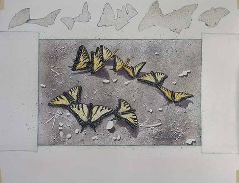
Last fall I started this 12 x 12" watercolour of a yellow rose laying on a bed of smooth pebbles. After many interruptions, I finally finished it three months later. Fortunately I took photos along the way, so I could share with you the steps involved in this piece. Here goes...

After drawing the rose onto my watercolour paper, and masking out a bit of twig on the right, I painted half of the pebbles, working around the rose shape. All the pebble colours were mixed from the primary colours French Ultramarine (blue), Permanent Alizarin Crimson (red), and Aureolin (yellow). I sprinkled salt on some of the pebbles while the paint was wet, to add a mineral pattern. Once the salt dried, I brushed it off.

Step 1 of Yellow Rose by Karen Richardson

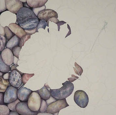
Tired of painting pebbles, I started working on the rose. This first layer shown below is just yellow with varying amounts of water to make the paint lighter or darker.

Step 2 of Yellow Rose by Karen Richardson

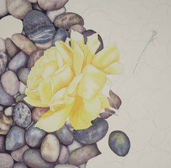
After the first layer was dry, I added a more yellow darkened with a bit of red and blue in the shadowy areas (below).

Step 3 of Yellow Rose by Karen Richardson

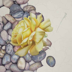
 Once the rose was dry, I switched back to darkening around each pebble with a dark mixture of the three colours. The rose is really starting to 'pop' now.

 Step 4 of Yellow Rose by Karen Richardson

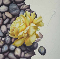
In the photo below, I have completed the first value layer on the pebbles in the right half of the painting (shown in the upper right quadrant), and started the second darker value layer (shown in the lower right quadrant).

Step 5 of Yellow Rose by Karen Richardson

Below you can see the pebbles on the right have had colour patterns added, to look more like real stones.

Step 6 of Yellow Rose by Karen Richardson

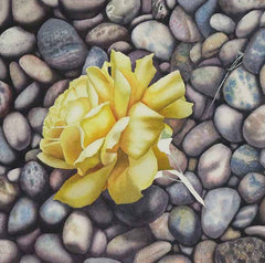
To complete the painting I added more shadows around the pebbles, created more patterns on the stones, painted the rose stem, removed the masking from the twig and painted it, and added the shadow cast by the rose onto the pebbles (shown below).

I researched the symbolism of yellow roses and discovered they stand for happiness, friendship, and caring. For this reason, I decided to title the painting You Are My Sunshine.

Subscribe to Karen's Newsletter for exclusive early access to new work, studio news updates, travel tales, painting tips, and notices of upcoming exhibitions.

Why do Butterflies Gather on Sandbanks?

07 November, 2015 5 comments Leave a comment

Last June, during our trip to British Columbia, I photographed these male Tiger Swallowtail butterflies on a sandy beach on a lake in northern Ontario. They stayed in the same spot for at least an hour, while we had a picnic lunch close by. At the time, I wondered what phenomenon kept them there in one spot for so long. Read on to the end of this article to find out the answer.

This fall, I taught a two-day watercolour workshop 'Butterflies on the Beach', using these reference photos. I began by masking off the paper margin and the butterflies with self-adhesive contact paper and drawing gum (masking fluid). Using a toothbrush, I spattered on lots of drawing gum, which forms a temporary, waterproof coating in the shape of small pebbles.

Then, using several mixtures of primary colours (Raw Sienna, Permanent Alizarin Crimson, and Indigo), I spattered on paint, sprayed on clear water, and tilted the paper to make some areas soften and run together in a cool, sandy colour. Once the paper had dried, I wiped the paint off of the plastic mask so I could take the photo below.

I peeled the plastic mask off of the butterflies and stuck the pieces onto the margin, in case I needed to re-use them. I removed all drawing gum from the sand background, to reveal white paper in the shape of small stones and large grains of sand.

Using the same primary colours mentioned above, I painted the butterflies with a pale yellow layer, let it dry, and masked out the intricate dots of light colour on the outside edges of the butterfly wings. When the masking was dry, I painted the black details over top. Then I painted in the shadows cast by pebbles and butterflies, as shown below.

To complete the painting, I removed all masking from the butterflies, added bits of blue and red dots on the wings, and bry-brushed in the details on all the little stones. Below is  the finished painting, with an integral margin. When mounted and varnished, the margin resembles a mat, such as one would use when framing with glass. The title is 'Sunbathing Swallowtails'.

Sunbathing Swallowtails (watercolour, framed size 19.5"h x 25.5"w)

Below is a detail of some of the butterflies.

Now, why do male butterflies gather at sandbanks, you ask? Apparently they are ingesting sodium and nitrates, often found in mud or damp sand. This process is commonly called 'mud-puddling', and is vital for digestion, reproduction, and flight. Who knew?

Subscribe to Karen's Newsletter for exclusive early access to new work, studio news updates, travel tales, painting tips, and notices of upcoming exhibitions.

Painting Twilight is Scary

19 October, 2015 6 comments Leave a comment

A few months ago, I made this watercolour painting for a client and, although it turned out to be a beautiful piece, it was a nail-biting process. For one thing, it is one of very few night scenes I have done, and the first time I painted glowing electric lights. Additionally, the shadows on the snow were very complex and risky to paint, and I had to invent the background scene. Yikes.

The process started with these photos below, supplied by the client. The first one established the angle of the building in the painting, and shows the big evergreen behind the cabin. This property, in central Ontario, is a weekend retreat that the client and her husband own. They go snowmobiling from here, and in the spring, harvest sap from the maple trees and produce their own maple syrup. The client commissioned the painting as a surprise for her husband.

This photo below shows the relative placement of the outbuilding and suggests more background trees - a combination deciduous/coniferous forest.

This photo below was taken at night, and sparked the idea for a twilight setting. Both the client and I thought that would give a more welcoming feel to the painting.

I started the painting project by drawing this 4 x 6" concept sketch below and emailing it to the client. She liked it and asked me to proceed with the painting. We agreed on a finished image size of 12" high by 18" wide, and the client decided to arrange for the framing herself.

I tested out several colour combinations in a 4 x 5" format, shown below. I decided the third one looked best.

The paint colours I chose were Prussian Blue, Prussian Green, Golden Lake, and Carmine Red. All the colours of the finished painting would be mixed from these four tubes of paint. I created the colour chart below as a permanent record of the pigments used, and the colour combinations they produced.

I transferred the sketch to a sheet of 300 lb. cold press watercolour paper, and masked out the moon, birch trees, the snow on the rooftops and evergreen tree, and the highlight on the side of the tree trunk on the right. (I used masking fluid, which protects the white of the paper until near the end, when the masking is removed and light-toned details are added.)

In step two below, the sky has been painted, the first layer of the forest is done, and the first layer of snow colours is complete.

In step three below, the cabin has been painted, using warm brown tones to contrast with the cool blue of the sky. The bright light on the left side of the cabin is just bare white paper. The foreground tree trunk has been painted.

In step four below, I applied a grey wash to darken and subdue the background forest. I added a second layer of shadowing on the snow. When the painting was totally dry, all the masking fluid was removed, exposing white paper.

In the final photo below, I have painted in all the details in the previously masked areas, and added a third layer of soft shadows to darken the snow. When I delivered the finished painting to the client, she was delighted with it, and proceeded to have it framed professionally.

Recently she commented: "The picture turned out great. My husband loves it! We celebrated our 10th anniversary in September so I gave it to him then."

'The Cabin: Moonlight and Memories' (watercolour, 12 x 18") by Karen Richardson. Private collection.

For more information on the general commission process, click here.

Subscribe to Karen's Newsletter for exclusive early access to new work, studio news updates, travel tales, painting tips, and notices of upcoming exhibitions.

How to Paint Sand, Stones, & Leaves in Watercolour

13 July, 2015 1 comment Leave a comment

I've taught my watercolour students how to paint stones and leaves many times, as they are some of my favourite subjects, and my students love them as well. But for the first time this spring, we added a new twist to two of my workshops, by painting a scene with these familiar objects on a bed of sand.

We started out by choosing actual stones and dried leaves and making a balanced composition with these objects on our 300 lb. watercolour paper, as shown below.

Using adhesive shelf paper and masking fluid, we protected the shapes of each object on the watercolour paper.

Then we painted the sand using fun, messy techniques like spattering masking fluid and paint, spraying with water, and tilting the paper to make colours run and mingle.

Once the sand layer was dry, we removed all shelf paper and masking fluid and painted the first value layer on the stones, and the cast shadows of each object, as shown below.

While the stones dried, we painted the leaves (shown below) and the shells.

Finally, we painted the details on the stones to complete our beach scene.

To see a larger view of my demonstration painting, click here.

Subscribe to Karen's Newsletter for exclusive early access to new work, studio news updates, travel tales, painting tips, and notices of upcoming exhibitions.

How to Paint Newfoundland Beach Rocks

08 April, 2015 3 comments Leave a comment

Have you wondered how to paint lifelike rocks? Check out this progression of photos from my recent watercolour class, 'Newfoundland Beach Rocks'.

Here are my four students working hard on their paintings.

First, I sketched a contour drawing in pencil on 300 lb watercolour paper, and masked out the white caps on the waves with masking fluid. Then, using New Gamboge, Antwerp Blue, and Permanent Alizarin Crimson, I mixed up some dull washes of paint and applied them to the boulders, using a darker mixture towards the bottom of each rock, and a lighter mixture on the tops. (The entire painting was created using only these three colours of paint.)

I wet the sky area with clear water and dropped in some blue and grey mixtures, leaving some white areas to represent clouds.

While the sky dried, I painted the ocean area using a slightly darker mix of blue. I pre-wet only the calm section directly under the headland, and then added horizontal strokes of blue, interspersed with strokes of clear water, starting at the top and working my way down toward the near shore. This produced the effect of waves. I added darker blue under the white caps.

When the sky and ocean areas were dry, I painted in the distant headland using a charcoal grey mixture. Then I dropped in spots of clear water to create intentional 'blooms' or pale shapes, simulating the look of distant shadowed cliffs.

Applying paint to dry paper, I started adding some stripes to the boulders, using various mixtures of grey and tan.

I completed adding stripes to most of the large boulders, and darkened the rock shadow areas using a dark grey mixture. I also darkened the ocean with a more vivid Antwerp Blue layer, and removed the masking fluid, to complete 'Newfoundland Beach Rocks', 10 x 8".

Subscribe to Karen's Newsletter for exclusive early access to new work, studio news updates, travel tales, painting tips, and notices of upcoming exhibitions.

Karen Richardson Artwork Featured on Artsy Shark

19 March, 2014 0 comments Leave a comment

I had some great news today - I am thrilled to be the feature artist on ArtsyShark.com, which is an American web-based company that teaches professional artists how to promote their work.

I started following Artsy Shark's blog about a year ago, when I was investigating ways to market my art instruction book Watercolour Toolbox, and found their blog posts to be full of great advice on all aspects of art marketing.

I applied last fall to be featured, but did not know until today when my work would be showcased.

The article captures my story in a nutshell - how travelling with my camera inspires my artwork and my art classes - and is illustrated with ten of my paintings of rocks and flowers.

Subscribe to Karen's Newsletter for exclusive early access to new work, studio news updates, travel tales, painting tips, and notices of upcoming exhibitions.

Do the World a Favour - Sell Your Art

25 February, 2014 1 comment Leave a comment

I read this excellent post on Artsy Shark today and wanted to share it with you. It's about why artists should continue to share their creations with the world by finding buyers for their art. I especially like the closing statement:

"As you have already experienced and know in your heart, your collectors are forever thankful each time they lay eyes on your art and the life-enriching spirit that is seamlessly wound into your art and bonded with their hearts.

My best advice after 50 years of sales: Love yourself, your talent, your art and your client’s long-term needs. Help them, guide them, and encourage them to become owners, today; not for the money – but because it is the right thing to do."


Click here to read the full article.

Subscribe to Karen's Newsletter for exclusive early access to new work, studio news updates, travel tales, painting tips, and notices of upcoming exhibitions.

Six E-commerce Solutions for Artists Pursuing Online Sales

19 December, 2013 0 comments Leave a comment

Courtesy of Artsyshark.com, here is some fabulous, practical advice for artists wanting to sell products on line.

I already use several of the recommended solutions: I sell my reproductions on Fine Art America, design and update this responsive web site on Shopify, and use Square to accept credit cards at shows or in my studio. Definitely worth the read:

http://www.artsyshark.com/2013/12/17/ecommerce-solutions

Subscribe to Karen's Newsletter for exclusive early access to her latest original paintings, travel tales, studio news updates, painting tips, and notices of upcoming exhibitions.

The Story of a Custom Painting

14 November, 2013 0 comments Leave a comment

When I create a custom painting for a client, the package includes a coffee table style storybook, telling how the painting came to be. Having this permanent art journal allows the client to revisit the creative journey at any time. I am pleased to share with you the story of my latest commission.

Last spring, a new client asked me to create a portrait of their home, as a surprise for her husband's 50th birthday. She came to my studio to discuss size, season, time frame and budget. Then she and I visited her home and decided on this view for the painting. 

She asked me to do a summer scene, when her garden would be in bloom, and to include certain elements in the painting, such as their three pets, and her husband's favourite truck. I took photos then and agreed to return for more photos in August.


In September, I drew a small concept sketch on graph paper to make sure the verticals were straight.

Once the client approved this concept, I made a full size layout drawing showing more details, such as the cats in the window and the dog on the front porch.


After approval, I traced the sketch onto watercolour paper, using a sheet of graphite paper to make the transfer. I used a ruler to make all the straight lines.


Masking fluid was applied temporarily to all areas that needed to stay white during the painting process.


I painted practice skies on scraps of watercolour paper, so I could choose the right combination of blues for the painting. Then I chose the other paints I thought would work and made colour tests to ensure I could mix all the colours I needed for the painting.


The sky wash was applied and allowed to dry overnight, and then I added the first layer of greenery.

I added window interiors, roof colours and a warm yellow wash on the front face of the home.


Using two mixtures, I painted the brick surfaces to look mottled. When dry, I added shadows under the eaves and porch.

After that layer dried overnight, I removed the masking fluid with a crepe eraser.


Below is the completed painting '180 Roseborough', watercolour 13 x 16.5".


With the storybook designed and ordered, I met the client at the framing gallery to select mats and molding. The framed painting and accompanying storybook were delivered to the client in time for the big birthday in November.  I do love a happy ending...

Subscribe to Karen's Newsletter if you wish to receive studio news updates.

Watercolour Demonstration: Hyacinth and Drystone

26 August, 2013 2 comments Leave a comment

While we were travelling around the Great Lakes in our RV last month, I created this painting based on a photo I took while visiting my Mom in B.C. on an earlier trip.

In the photo below, I have started with a pencil sketch on 300 lb watercolour paper and masked out the flower and leaves with Pebeo Masking Gum. I like the fact that it is dark enough to show up against the paper, allowing for better application accuracy.


Once the mask was fully dry, I used Indigo paint on the shadowed crevices between the stones. When dry, I spattered a fine spray of masking gum over the whole painting (using a tooth brush and a pot scraper), to preserve fine white dots in the stones. Then I spattered on a fine spray of Indigo paint and let everything dry overnight.


The next day, I gently wet the entire painting with clear water using a soft, natural hair brush, to disturb the Indigo spatter as little as possible. I gently dropped in muted mixtures of Indigo, Burnt Sienna, Primary Red and Aureolin (yellow). I waited about a minute for absorption and evaporation to reduce the wetness of the wash, then sprinkled table salt sparingly over the entire painting. I let the painting dry overnight.


After brushing off the dry, dirty salt using my pot scraper and fingers, I created a 3-dimensional effect on the stones using my 2-brush technique. I added dark shadows on stones beside the crevice lines, using a brush loaded with Indigo paint, and softened the edge of that shadow towards the centre of each stone, using a brush loaded with clean water. I used as few brush strokes as possible, to minimize disturbance of the previous paint layer.

Once the paper had fully dried, I erased the masking fluid with a crepe eraser, revealing white paper underneath. Some of my pencil lines disappeared in the erasure process, so I redrew them where necessary.


On dry paper, I painted each leaf and the stem, using mixtures of Indigo, Sap Green and Aureolin.


I completed painting the leaves, then defined the petals using Primary Red, Burnt Sienna and a touch of Indigo. A few shadowed areas and white dots were darkened where needed, to complete 'Hyacinth and Drystone', watercolour, 12 x 9". 

If you have comments you wish to share, please do so using the 'Leave a Comment' button at the top of this post. 

Subscribe to Karen's Newsletter for exclusive early access to new work, studio news updates, travel tales, painting tips, and notices of upcoming exhibitions.