Pictured above are the five new paintings I made last month. To my great delight, the three canoe scenes have found new homes already, thanks to my daily posts on Facebook and my 2000 wonderful friends and followers there.

Shown above is the first canoe scene, Secrets of the Mist (8 x 8"). This little painting was inspired by a photo I took last fall on a lunch cruise of Lake Muskoka, organized by the Women's Probus Club of Lindsay, of which I am a member.
I had been hoping for fine weather for our cruise and when I heard the wet forecast I figured I wouldn't get any good scenery photos. How wrong I was. The rain provided a misty atmosphere and I ended up with dozens of paint-worthy reference photos. I added the red canoe to the painting to introduce a human presence and a pop of colour to the scene.
I posted an in-progress photo of this painting on Facebook on Jan. 23, and the finished version the next day. By Jan. 25 I had four offers to purchase - from collectors in Muskoka, Whitby, Brighton, and Oshawa. The Facebook post of the finished painting went on to garner almost 400 'likes' and 200 comments, which I think is the highest response to date for a single post of mine.
For more information about this painting click here. This artwork is going to a collector in Whitby.

Not wanting to disappoint the other three collectors, I painted a second 8 x 8" version of this scene, Secrets in the Mist, shown above. Click here for more details. This one went to its forever home in Bracebridge.
I plan to paint more versions of this scene in other sizes and will offer them to the remaining interested parties on a 'right of first refusal' basis before showing the artworks to the general public.

The third canoe scene, Bring a Paddle (12 x 12", shown above) was inspired by numerous reference photos of northern lakes, islands, and canoes. I was particularly pleased with the way the water ripples and reflections turned out.
Shown below are the reference photos for the lake reflections and autumn foliage, a concept sketch for the island, and the initial layout drawn in pencil on watercolour paper.

I posted in-progress photos of this painting on Facebook on Jan. 28 and 29, and had an offer to purchase before the painting was finished. The Montreal buyer said "I keep missing opportunities to get the ones I love. The last one left before I could... Bring a Paddle already has my heart even if not done yet... As soon as I saw it I knew I couldn't live without [it]... I see great things all the time but yours speak to me." Click here to see more details about this painting.
If you wish to see my paintings on Facebook as they are created, here is the link https://www.facebook.com/karen.richardson.studio.

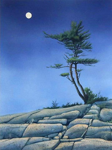
Shown above is Morning Has Broken, watercolour 9 x 12". It was inspired by several of my photos which are shown below: two of an amazing morning sky I saw from my front porch, one of the sun reflected in a lake, and one of a white pine. The rocky ridge was inspired by many I have seen during my travels throughout northern Ontario. The photo below also shows the concept sketch for a tree on rocks, and the initial stage of the painting after the first layer of colour was applied to the background.

The sky was quite difficult and its depth of colour eventually was achieved with many layers painted over several days. I really enjoyed painting the tree with its branches reaching outward, as if Mother Nature is embracing the dawn. You can see further details about this piece here.

The fifth painting from last month is Lady in Red, watercolour 14 x 11", shown above. One of my Facebook acquaintances, Gerry Kaiser, is a professional photographer from Windsor, Ontario. Last October he posted a glorious photo of a red and gold sunset he took at Point Pelee National Park (Lake Erie). Gerry kindly gave me permission to use the photo as reference for my watercolour painting.
This was an extremely challenging subject. I masked out the sun and its reflection and then painted the sky wet-in-wet with several layers to achieve the depth of colour. I painted the lake reflections on dry paper using hundreds of horizontal strokes of colour. There was a lot of experimentation involved in this piece but I was very happy with the result.
When I posted an in-progress photo on Facebook and asked for suggestions for a title, I received 80 responses. I chose Lady in Red and recorded the rest to use for future sunset paintings. (Lady in Red was the name I gave to my third motorcycle, a red Honda Pacific Coast.)
I wrote a description for the painting using some of the beautiful words suggested by my Facebook friends: "This painting presents the fiery crimson blaze of the setting sun making her final bow before the heavens fade to black. Her radiance is reflected on peaceful waters as shimmering ribbons of scarlet and gold. We all have fond memories of splendid days that ended with breathtaking displays like this one."
You can see more details about this painting here.
As our winter continues, I look forward to creating more new paintings and sharing with you the stories behind them.
Which painting is your favourite? If you have comments you wish to share, please do so using the 'Leave a Comment' button at the top of this post.
Subscribe to Karen's Newsletter for exclusive early access to new work, studio news updates, travel tales, painting tips, and notices of upcoming exhibitions.