WHY FRAME WITHOUT GLASS?
I am pictured above at an arts festival in 2015 with a display of my watercolour paintings presented without glass. I began using this framing method in 2011, taking advantage of technological advances in art materials. I like the clean, contemporary look of the thin black frames and no glass.
Prior to this, for the first few decades of my art career, I protected my watercolour paintings in the traditional manner, with museum quality matting and backing board, UV-blocking glazing, and coordinated moldings to hold the 'sandwich' together. Examples of this presentation are pictured below, at an art festival in the early years.

These traditional archival materials worked well to shield the artwork from environmental damage, but were heavy and fragile to transport and display. The worst aspect was that reflections in the glass often impeded viewing of the painted image.
With my new method of mounting, the artwork is created the same way but sandwiched differently. I still paint on 300 lb. acid-free 100% rag watercolour paper. After the painting is completed, it is supported from behind by an archival wooden art panel and sealed on the front with a UV- and moisture-resistant coating that takes the place of glass.
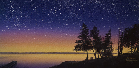
The art panel is then mounted in a simple black wooden float frame, as shown in the 12 x 16 inch painting below 'Come Fly With Me'. This new process provides a clean, updated look to the artwork, helps protect the painting from humidity and colour fading, and allows the piece to be hung without the glare and weight of glass.
Now my watercolours have the visual impact of an oil or acrylic painting, while still showcasing the soft colour transitions and glowing light effects of traditional watercolour. I think of this as having the best of both worlds.

HOW DOES THIS FRAMING METHOD WORK?
People ask me this question frequently. Sometimes they are curious collectors but often they are fellow artists who wonder if they too can present their artwork without the weight and glare of glass.
I summarize my experiences here, so that art collectors can be better informed when contemplating an art purchase, and artists can choose safe procedures and materials, and avoid potential problems.
That said, if you are an artist and wish to display your paintings without glass, I encourage you to do your own research and find the archival method that suits your circumstances and keeps your artwork protected. I place a lot of trust in art material manufacturers' recommendations based on actual science, rather than those of well-intentioned but possibly ill-informed artists on YouTube.
An example of a trusted resource would be this printable instruction sheet 'Mounting Flexible Supports to Panel, an Archival Practice', produced by Ampersand (manufacturer of art panels). This article includes instruction for mounting canvas art as well as paper art.
Outlined below are the methods and materials I use to mount and varnish my watercolour paintings, along with some important tips I have learned over the last decade. The process takes about a week to complete and can be somewhat perilous for novices. Remember that mounting your painting to a panel is non-reversible, so start with a small sample painting while you learn and test the process. Also bear in mind that some art societies might consider a watercolour painting coated with acrylic varnish to be a mixed media artwork.
TEN STEPS TO MOUNT AND VARNISH A WATERCOLOUR PAINTING
(A printable version is available at the end of this article.)
1. Obtain an art panel which has already been sealed and primed, and a floater frame that will fit. Panels come in standard sizes; the smallest I use is 8 x 8 inches and the largest is 24 x 36 inches. My favourite panels are Jack Richeson cradled gessoed tempered hardboard panels, ApollonGotrick gesso wood panels, and several coated panels made by Ampersand (Claybord, Gessobord, or Primed Smooth Artist Panels). I prefer the 3/4" or 7/8" panel profiles. I buy custom floater frames that will fit the panel profile plus the thickness of the watercolour paper and still have at least 1/8" of the frame protruding beyond the front surface of the artwork. This will protect the vulnerable edges of the painting.
2. Complete a finished painting on 300 lb. acid-free Arches watercolour paper, with an image that is 1 inch longer and 1 inch wider than the panel. The excess paper will be trimmed off after mounting is complete. Thinner papers will show any unevenness of the adhesive layer, so avoid 140 lb. paper. I do the mounting after the painting is done for two reasons; the mounting adhesive affects how paint behaves on the paper, and I don't want to risk wasting a panel with an unsuccessful painting.
3. Decide where the image will need cropping, to become the same size as the panel, but don't cut the watercolour paper yet. On the back of the paper, draw a pencil outline of where the panel will need to be placed. If your painting scene has a horizon, make sure it aligns parallel with a panel edge.
4. Place the painting face down on a hard, flat surface that is covered by a clean towel. Wet the back of the painting with clean water using a sponge. Quickly apply a thin coat of Golden Soft Gel Matte acrylic medium to the surface of the panel, using a two-inch flat brush. This needs to be done in about 30 seconds so the adhesive stays evenly wet. (Use a cheap brush, because the dried adhesive eventually builds up in the brush hairs, no matter how carefully I rinse the brush.)
5. Flip the gel-coated panel over and place wet side down onto the back of the wet paper, aligning the panel within the pencil lines from step 3. Press hands hard on the centre of the panel to force air bubbles out the sides. Pile on heavy objects (stacks of books work well) on the centre of the panel to make sure the paper and panel are squeezed tightly together. (See photo below) Leave overnight to dry, then remove the weights and flip the painting front side up to continue drying.

6. After another day, or once the painting feels fully dry, paint the edges of the panel with black acrylic paint. I usually apply two coats. The flange of watercolour paper helps to protect the front of the artwork from the acrylic paint. (Shown below)

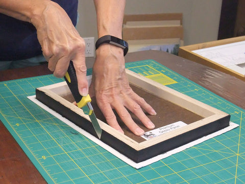
7. Once the acrylic paint is dry (30 minutes), place the painting face down on a clean cutting mat and remove the paper flange with a very sharp utility knife. Make the cuts vertical and flush with the panel edge (shown below). When done, use a fine grit sanding block to sand the edges of the paper to remove any burrs.
8. The exposed thickness of the watercolour paper is white. Paint it with a black or very dark watercolour mixture (shown below). I mix my black from the three primaries. This dark colour will make the paper look like part of the panel rather than a separate layer. Do not use a black marker or acrylic paint, as it is too easy for these pigments to bleed over onto the front of the painting. Leave the painting face up to continue drying for several days before varnishing.

9. I never varnish my paintings in my studio, because of the toxic fumes. I set up my turntable stand in a garage with ambient temperature between 65 and 75 degrees F (18 to 24 degrees C). The varnishing process takes me a whole day because there are seven coats, with at least 45 minutes drying time between each coat. I varnish my paintings in batches of 4 to 6 pieces to make the process more efficient. I wear a respirator mask and use a spray varnish that does not disturb the watercolour paint. I start with three coats of Golden Archival Varnish (Mineral Spirit Acrylic Aerosol with UVLS) Gloss, followed by four coats of the Matte version. (Shown below).

This non-yellowing finish protects the artwork from dirt and dust and is moisture resistant. UVLS stands for UltraViolet Light filters and Stabilizers, which provide archival protection and reduce light damage. According to Golden, manufacturer of artist paints and varnishes, it takes a minimum of six coats of varnish to provide UV protection. The gloss coats seal the surface while keeping the painted image sharp, and the matte coats eliminate glare. I have not noticed any colour change caused by the varnish. It does add a slight texture to the surface of the painting. I have read that this varnish provides better UV protection than UV-blocking glass offers. I let the varnish dry overnight in the garage, to allow most of the smell to dissipate, before bringing the painting back to my studio.
10. After the varnish has dried for at least two days, I attach the frame to the back of the panel, add a hanging wire, and label the back of the panel with artwork and artist information. Now the painting is ready to hang on a wall.
I hope you have found this information helpful and interesting. Click here for a printable version of the above steps.
If you have comments you wish to share, please do so using the 'Leave a Comment' button at the top of this post.
Subscribe to Karen's Newsletter to see more of her painting stories, travel tales, studio news updates, or notices of upcoming exhibitions.
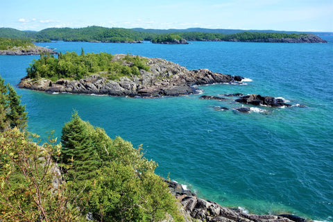
 This past August, as my husband and I explored the north shore of Lake Superior with our travel trailer in tow, we had the immense good fortune to obtain a serviced camping site for a week in a most amazing place that very few people have heard about: Pukaskwa National Park.
 Over the years, we had seen the sign for the turnoff to this Park on Hwy 17 between Wawa and Marathon and finally dropped in for a few hours in the summer of 2020, to check out the camping facilities.