Over the past winter and spring, I have devoted myself to building a fresh collection of landscape paintings, destined for display and sale at my retail gallery partners.
I experimented with new composition strategies and colour combinations, and feel that this sustained burst of creative intensity has allowed my paintings to reach a new level of clarity and emotional resonance.
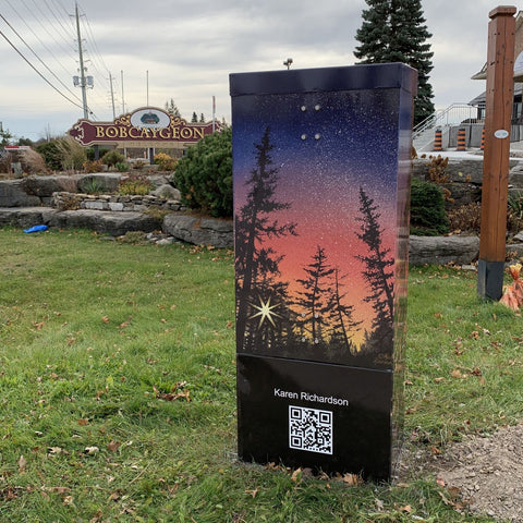
Pictured with me here are five special artworks I selected for the Miskwaa Open Air Art Show & Sale 2023, which runs daily in July and August.
In this post, I am very excited to share a show preview with you, and hope this brief overview inspires you to see these artworks in person.
 Living the Dream, varnished watercolour on 12 x 12 inch panel
The concept of an ideal life may look different for others, but mine includes quiet moments spent at northern lakes, drinking in the splendour of the seasons. Peaceful places like this, where I slow down and connect with nature, replenish my soul.
The colourful autumn forest with its slightly blurred reflection was technically difficult to paint in watercolour, and until I was about 90% done, I was certain this painting was a failure. Having invested hours and hours of time in this piece already, I pressed on and was incredibly relieved when it transformed into a believable scene. Tenacity wins the day!
Living the Dream is available at the Miskwaa show, valued at $1,070. including tax.
 Quality Time, varnished watercolour on 9 x 12 inch panel
Going on an excursion with our loved ones, quietly exploring a northern lake, and basking in the beauty of unspoiled nature, provides respite from busy lives. How lucky are we who get to spend quality time like this.
I tried a new colour combination for the sky and water in this piece and am happy with the peaceful feeling it adds to the scene. The setting was inspired by Lake Muskoka, and I saw these canoeists with their dog in Pukaskwa National Park on Lake Superior.
Quality Time is available at the Miskwaa show, valued at $730. including tax.
 Daybreak, varnished watercolour on 10 x 10 inch panel
In this winter scene, stars begin to fade as a blaze of sunlight heralds the beginning of a glorious new day. The golden hues of dawn bring welcome warmth after a cold winter night.
Although this is an imaginary landscape, the trees are inspired by my vast photo reference library from many years spent exploring the forests of northern Ontario.
Daybreak is available at the Miskwaa show, valued at $680. including tax.
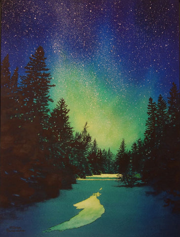
 Dancing in the Dark, varnished watercolour on 12 x 12 inch panel
Northern lights ripple across the night sky, reaching down to touch the horizon. A tiny island, cloaked in evergreens and nestled in mist, beholds the spectacle. It is as if the aurora are asking the trees to dance.
This is another imaginary scene, inspired by an island I photographed at Lake of the Woods.
Dancing in the Dark is available at the Miskwaa show, valued at $890. including tax.
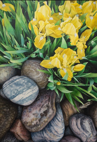
 Steadfast and True, varnished watercolour on 16 x 12 inch panel
Rocky shores of northern lakes are subject to relentless natural forces, such as wind, waves, heat, cold, and ice. And yet, these robust stone beaches survive the test of time. I admire their strength and beauty.
I began this piece by painting, from my imagination, a graded blue wash for the sky and water, then adding the orange of a sunset where the horizon would fall. The foreground stones of this scene were inspired by a pebble beach at Lake Superior and the island was one I admired at Lake of the Woods.
Steadfast and True is available at the Miskwaa show, valued at $1,300. including tax.
I hope you have enjoyed this personal private tour of my Miskwaa Collection for 2023.
If you have comments you wish to share, please do so using the 'Leave a Comment' button at the top of this post.
Subscribe to Karen's Newsletter for exclusive early access to new work, studio news updates, travel tales, painting tips, and notices of upcoming exhibitions.


 I decided to spend a few months this winter and spring focusing on painting cloudy sunset scenes, to try to determine where I had been going wrong in the past, and figure out what strategies might work better.
 The painting was inspired by this photograph I took of the view from my bedroom window last December. The trees grow in the hedgerow between farm fields behind our house, and every morning I look out my window to absorb the beauty of nature.
 The Wonder of It All, varnished watercolour on 6 x 12 inch panel depicts a glowing sunset over a northern lake. Sometimes I look at a splendid sky and just have to marvel at the artistry of nature. She creates the most marvellous paintings, just using light and water vapour. I am awed by the wonder of it all.
 The painting was inspired by this photo of Six Mile Lake in Muskoka, taken by Sharon Hopkirk and used with her gracious permission.
 I was still entranced by Sharon's gorgeous photo, and started a second attempt at painting the full scene. I took a photo at the end of each day so I could show you the layering process.


 This ambitious painting project - the largest watercolour I have ever done - took me two months to create. It was pure joy to paint, if a bit intimidating, due to the large scale of the piece.


 Listen to the Silence, varnished watercolour on 14 x 11 inch panel.
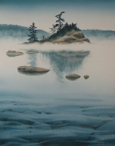

 Reunion, varnished watercolour on 10 x 10 inch panel.
 For this painting, I used her reference photo (shown here) for the foreground and invented a couple of islands to make a more interesting scene. I changed the canoe colours and decided to make the season autumn, so the trees would complement the canoes.
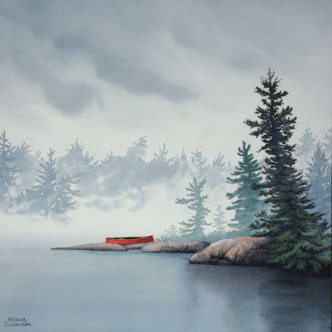

 Some Enchanted Evening, varnished watercolour on 16 x 12 inch panel.
 Maple Flooring, varnished watercolour on 11 x 14 inch panel.