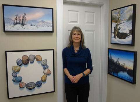
This year I have been spending lots of quality time in my art studio, working on a half dozen large paintings.
The four new watercolours pictured here with me are part of this collection and share an interesting coincidence.
When my husband and I were travelling in the Airstream last summer, I was able to make only small paintings at our dinette. About four months into the trip, I started to yearn for my roomy home studio so I could create some larger, more impactful paintings.
In this state of mind, I perused my digital folder of hundreds of finished paintings going back 30+ years and made a list of a few dozen extraordinary images that I felt would be suited to large-scale paintings.
In other words, I planned to employ the original paintings as preliminary studies for big, exciting scenes that still hold a piece of my soul, using skills that (I hope) have been honed to higher levels of excellence.
I am so excited to share with you the re-imagined works I have painted this winter.

We Are All Connected, varnished watercolour on 24 x 24 inch panel, $1800.
This is the third stone circle I have painted and the largest so far.
All my stone circle paintings symbolize unity and the stripes on the stones represent the traits we share that connect us together, even though we are unique as individuals. My hope is that we focus on what unites us, rather than what divides us.
For details on availability of We Are All Connected, click here.
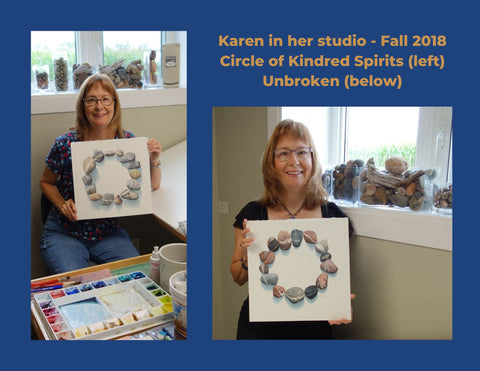
The first two stone circle versions were each 12 x 12 inches, inspired from actual striped pebbles from my own collection, and completed in 2018.
They are Circle of Kindred Spirits and Unbroken. Both titles were suggested by my Facebook followers and both paintings found new homes.
The Unbroken image was licensed in 2019 for an album cover by Canadian gospel singer/songwriter Terry Posthumus, who also acquired the original painting to display in his recording studio. You can read about this fascinating art/music journey here: The Unbroken Story - Why My Painting is on an Album Cover

Winter's Embrace, varnished watercolour on 20 x 16 inch panel, $1500 (shown left).
This painting is a reinterpretation of Snow Flurries (pictured below), an imaginary 12 x 8 inch scene I painted in 2004, that was inspired by many snowmobile adventures in the Ontario wilderness.
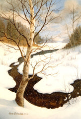
Even though this is a winter scene, it feels cozy and inviting to me. The pillowy snow and the warm tones of birch tree, creek, clouds, and shrubs make the viewer feel welcome and sheltered.
For information about availability of Winter's Embrace, click here.
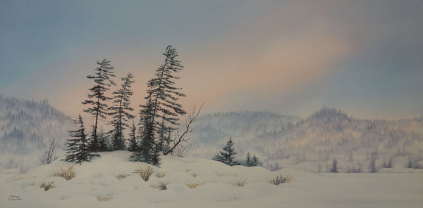
Untouched, varnished watercolour on 12 x 24 inch panel, $1400 (shown above). This painting captures the soft, rosy light of a calm winter morning at the lake. Stately white pines cluster quietly on a rocky island, listening for the faintest whisper of the wind. For details about this painting's availability, click here.
Untouched is a reinterpretation of Enchantment (shown below), a 5 x 14 inch painting I created in 2006.
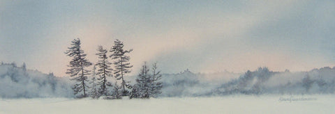
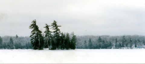
My initial inspiration was a photo I took back in the 1990's (shown below), on a snowmobile trip in northern Ontario.
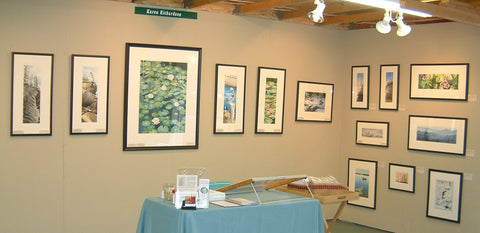 This is a photo of my booth at the 2006 Buckhorn Fine Art Festival, where Enchantment was sold to a collector. It is the tiny painting in the middle of the far right wall. In those days, I was framing my watercolours with mats and glass. Now I mount them on art boards and varnish with a UV blocking coating, eliminating the need for glass. You can read about my framing process in this article: Framing Watercolours Without Glass.

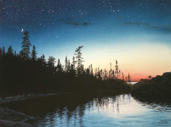
Superior Stillness, varnished watercolour on 16 x 20 inch panel, $1500, captures a twilight moment, when majestic trees are silhouetted against a simple sunset and everything is quiet. Water laps gently against the rocky shore as moon and stars look on from above.
The location is Picture Rock Harbour in Pukaskwa National Park, which is on the shore of Lake Superior near Marathon, ON. Places like this make my spirit soar. For information on availability of Superior Stillness, click here.
 This is the third time I have painted this scene, and it resonates so powerfully with me, I feel like I could paint it again sometime in the future. This artwork celebrates all I hold dear about northern scenery: vast skies, clear blue water, smooth stones, and hardy pine and spruce trees.
The first two interpretations of the scene were created in 2020. They were titled Be Still (8 x 8 inches, shown left), and And Time Stood Still (12 x 16 inches, pictured below right).
The inspiration for all three paintings was a photo taken by Tania Bortolon Krysa, who I met through Facebook. Tania loves the same kind of wild places that I do and takes excellent photos during her adventures.
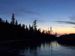 She was on a back country camping trip and her party stayed overnight in tents on this beach. She graciously granted me permission to use her stunning sunset photo (shown left) as reference for my artwork.
I hope you have enjoyed this behind-the-scenes look at my recent paintings. There are many ways to interpret the beauty of nature as works of art. I am finding new avenues to express my deepest, heartfelt admiration for this rugged land that speaks to my soul. Stay tuned for more of my re-creations in this new collection.
Which painting is your favourite? If you have comments you wish to share, please do so using the 'Leave a Comment' button at the top of this post.
Subscribe to Karen's Newsletter for exclusive early access to new work, studio news updates, travel tales, painting tips, and notices of upcoming exhibitions.
 This year, the Kawartha Art Gallery in Lindsay, ON invited me and other member artists to participate in a new initiative, Palette Partners, a community art and local business partnership.
 Three of my paintings were selected to display at Milk & Honey Eatery, a newly-opened restaurant at 18 Kent St. W. in downtown Lindsay.


 Last spring, fortunate folks from around the world were privileged to witness spectacular displays of northern lights.


 Twenty years ago, my husband and I spent a sunny August weekend at a lodge on a cluster of tiny islands in Georgian Bay. While kayaking there, I was treated to my first up-close views of the iconic rock of that region of Ontario.
 A Place of the Heart, varnished watercolour on 14 x 11 inch panel, $900.
 The Windy Shore, varnished watercolour on 20 x 16 inch panel, $1500.


 The most difficult part of this scene, believe it or not, was the forest. I knew I had to get that right before I invested weeks and weeks into painting stones.


 If you are like me, whenever this time of year rolls around I yearn to see fresh colour.


 If you have not visited The


