Teaching fall watercolour classes to almost 60 students kept me very busy in November, so I was delighted to somehow fit in the completion of seven beautiful new paintings last month (pictured above).
The two larger pieces I finished were very satisfying, as they represented a considerable investment of time and expertise to complete. The first one, 'Lapping Waters', watercolour on panel (no glass) 16 x 20" is from my Lake Superior series and is shown below.

I love the glow of light on the water and wet beach, and the contrast of vivid blue water against the warm hues of the sand. This was a technically difficult painting, with each section requiring multiple layers of paint to smooth out the gentle colour gradations.
This beach is at Neys Provincial Park on the north shore near Marathon, ON. The Little Pic river flows into Lake Superior here, depositing sand and driftwood onto an extensive beach. This is a popular spot for family holidays during the summer, as the sand bottom extends several hundred feet out into the lake, making for safe swimming conditions. Here is the reference photo I worked with to make the painting.

Years ago, logs were floated down the Little Pic River each spring, gathered into booms, and towed to the pulp mill at Marathon. The driftwood in this scene serves as a reminder of the logging history of this place.
Click here to see more details about 'Lapping Waters'.
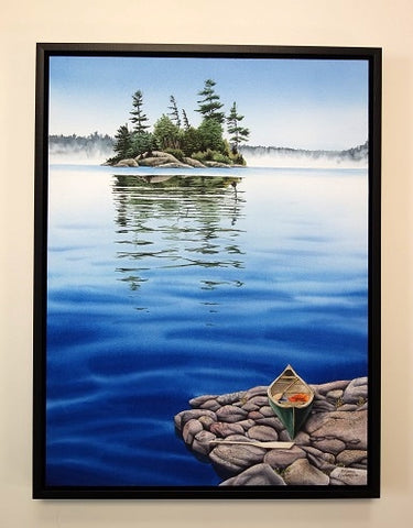
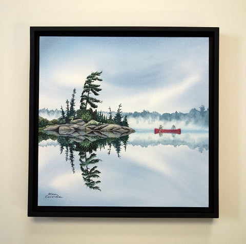
The second large painting completed last month is from my Northern Lakes series. 'Peaceful Passage', watercolour on panel (no glass) 16 x 20", is shown below.

I love creating the effect of fog and mist with watercolour. It has taken me years of practice to learn how to paint misty backgrounds effectively. I like the contrast of clear, strong colours in a dramatic foreground against a backdrop of misty, pale gray. I enjoy the sense of mystery that fog brings to a painting, as if it were inviting the viewer to create the narrative behind the scene.
This imaginary composition of islands in a northern lake was derived from a couple of my reference photos taken at Lake Muskoka and Lake Superior, and a canoe photo I obtained from a friend. Shown below are the landscape references.

Click here to see more details about Peaceful Passage.
Continuing with my Northern Lakes series is 'Hidden Secrets', watercolour on panel (no glass) 12 x 12", shown below.

I think this is one of my most successful fog scenes so far. I am captivated by the drama of the dark silhouettes of the island trees emerging from veils of fog. I love the luminosity of the mist and the soft reflections in the lake.
I obtained the reference photo for this painting from a Facebook acquaintance, who gave me permission to make a painting from her photo, which is shown below. She said the location is Loon Lake, north of Huntsville, ON.

Click here to learn more details about Hidden Secrets.
The next new piece in my Northern Lakes series is 'Just Breathe', watercolour on panel (no glass) 16 x 12", shown below.

This is another imaginary scene, but the feel of this place is so real that I want to go there. I love the way the majestic pines dominate the vertical composition and lead the viewer's eye to the canoe resting on the rocky shore. The foggy background adds contrast and mystery to the scene, and we wonder why the paddler stopped here. I like the way the autumn foliage echoes the warm hues of the canoe.
I used two reference photos of trees (shown below) to compose this painting, both from the Temagami region of northern Ontario.

Click here to see more information about Just Breathe.
The next painting 'One Last Cast', watercolour on panel (no glass) 8 x 8" was a commissioned piece for a client and is shown below.

The client wanted a painting similar to a previous piece of mine that was titled 'Last Cast', but asked if I could include the client's own boat and dog in the scene and change the colour scheme from pink to orange. The previous painting and new photo references are shown below.


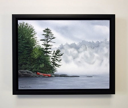
The final two paintings from November were inspired by our trips to Newfoundland. The first piece 'Classic Rock', watercolour on panel (no glass) 12 x 6" is shown below.

This pebble and boulder beach is in Gros Morne National Park on the west coast of Newfoundland and is a scene I have painted many times. Classic rocks like these just never get old! Here are some previous versions I painted of this beautiful spot.


The second new painting inspired by Newfoundland is in my StoneGarden series and shows a Monarch butterfly resting on smooth beach pebbles. This piece is titled 'Sacred Spirits', watercolour on panel (no glass) 12 x 12" and is shown below.

When researching the title for this painting, I discovered that some people believe butterflies represent the spirit world, and sighting a Monarch butterfly means your guardian angels are guiding and protecting you.
I photographed the reference butterfly in the Insectatorium in Deer Lake, and the stones were inspired by pebble beaches in Gros Morne National Park. Both of these places are on the west coast of Newfoundland.
Click here to find out more details about Sacred Spirit.
That wraps up my November creations. I hope you have enjoyed this glimpse into how I translate photos from my travels into unique artistic expressions. My hope is that my artwork will welcome viewers like old friends, and draw them into the narrative behind the art. Stay tuned to see what old friends December brings!
If you have comments you wish to share, please do so using the 'Leave a Comment' button at the top of this post.
Subscribe to Karen's Newsletter for exclusive early access to new work, studio news updates, travel tales, painting tips, and notices of upcoming exhibitions.