December was another busy month in my art studio, with the completion of the six new watercolours pictured above.
My northern lakes series continues and some unique and luscious skies have been introduced, depicting the magical effects of dawn, sunset, twilight, and starlight. I am enjoying this chance to work with bright, happy colours that lift my mood during this cold season.
Today, I am sharing the stories behind the creation of these new artworks.

Shown above is Almost Heaven, varnished watercolour on 12 x 6" panel. A venerable white pine stands guard over a peaceful northern lake as stars begin to fill the sky. The final glow of sunset rests on calm water. Places like this are almost heaven to many of us.
The scene is imaginary, but the tree details were loosely inspired by the photo below.

I spotted this interesting white pine from Hwy 17 as we drove through Lake Superior Provincial Park last July, and took the photo from our truck. I love the way white pines tower over surrounding trees, like gigantic guardians of the forest.
For more details about Almost Heaven, click here.

Pictured above is Up at the Crack of Dawn, varnished waterdolour on 6 x 12" panel. Folks who get up early in the morning witness some breathtaking sunrises. In this scene, a streak of golden light parts the veils of darkness to reveal the trees and gently rolling hills of a northern landscape.
This painting was inspired by the photo below, which I took decades ago from a moving vehicle in an unknown northern location. I have kept this photo aside since then, knowing it would spark a great painting some day.

I love the feeling of mystery in this hint of landscape as dawn breaks on the horizon. It took many coats of paint to achieve the level of darkness and the glow of light behind the trees that was needed to create a magical effect.
Click here for more information about Up at the Crack of Dawn.

Shown above is Beyond the Blue, varnished watercolour on 12 x 12" panel. I am thrilled with the feeling of the finished work. The glow in the sky conveys that mystical time just before dawn. A light mist is rising from the lake and millions of stars still shine in the heavens. Soon the sun will burn off the remnants of night and a new day of adventure exploring these rocky islands will begin.
This painting is mostly from my imagination, loosely suggested by a long-exposure photo (shown below) taken by my friend Carolyn Caughell in Torrance Barrens Dark-Sky Preserve near Gravenhurst, ON.

I loved the starlight and the blues in her photo but completely reinvented the landscape and emphasized the stars when I created my painting.
To see more details about Beyond the Blue, click here.

Pictured above is And Time Stood Still, varnished watercolour on 12 x 16" panel. This painting was inspired by a photo I saw on Facebook, taken by Tania Bortolon Krysa during her back country hike on the Mdaabii Miikna Trail in Pukaskwa National Park last August.

Tania's photo (shown above) captured a quiet twilight moment and I loved the shapes of the iconic northern Ontario trees. She kindly allowed me to use her photo as a painting reference. This is the second version of this scene that I have painted.
My husband and I visited this breathtaking park near Marathon, on the north shore of Lake Superior, around the same time this photo was taken, and plan to return for some hiking and kayaking in the future.
Click here for more information about And Time Stood Still.

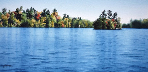
The painting shown above is The Place I Belong, varnished watercolour on 8 x 8" panel. The sky is imaginary, but the land formations and trees are taken from a photo I took on Lake Muskoka in October 2018 while on a site seeing cruise. The photo is shown below, and you can see I took considerable license with shapes and colours.

For more details about The Place I Belong, click here.

Shown above is the last painting I created in December, Time to Reflect, varnished watercolour on 10 x 10" panel. The sky is from my imagination and the treeline is similar to one I used in my previous painting Exit Light, Enter Night (shown below).

For more information about Time to Reflect, click here.
As winter days begin to lengthen, I look forward to creating more new paintings and sharing with you the stories behind them.
Which painting is your favourite? If you have comments you wish to share, please do so using the 'Leave a Comment' button at the top of this post.
Subscribe to Karen's Newsletter for exclusive early access to new work, studio news updates, travel tales, painting tips, and notices of upcoming exhibitions.