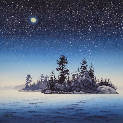
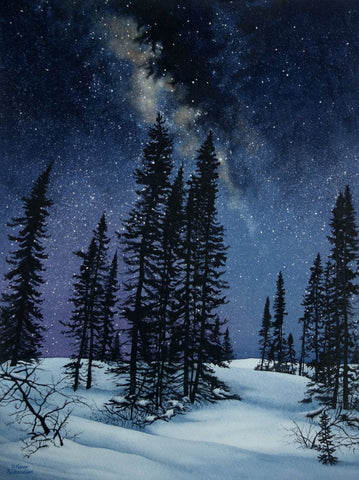
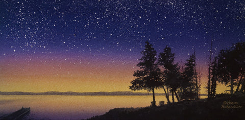
After a year spent focusing on my starlight series, making paintings featuring moonlight, northern lights, and sunsets, I felt the urge to paint rocks again.
If you don't already know, rocks and I go way back... All my life, I have felt the magnetic pull of stone, from mountains to boulders to pebbles to grains of sand. I find all these forms of rock to be utterly fascinating and beautiful.
Perhaps it was my childhood spent near Algonquin Park, surrounded by the terrain of the Canadian Shield, that makes me instinctively drawn to rock-filled wilderness scenery.
So, last month I pulled out some reference photos I took last summer on Lake Superior while we camped at Rainbow Falls Provincial Park near Rossport, ON. This is a gorgeous park with a pebble beach and huge boulders and bedrock along the shore.

I love to explore these rocks and ponder how Nature carved these shapes with water, wind, and ice. Imagine the stories this stone has witnessed over millions of years.
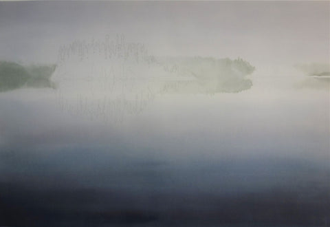
I had dozens of inspiring photos to choose from and settled on this gem featuring a huge rock slab shoreline. When I took the photo, I made sure a tree was reflected in the large puddle. I made a vertical shot so the cracks in the foreground rocks lead the eye into the scene. The photo had been taken on a partly cloudy day but I was able to lighten and brighten it before printing, to simulate a sunnier scene.
I decided on a half sheet painting (22 by 14 inches) that fit a custom art panel and float frame I had on hand, and sketched the scene onto 300 lb watercolour paper.

After making colour tests to make sure I could mix the colours I would need when painting this subject, I selected Sennelier primary paint colours (Sennelier Red, Sennelier Yellow Deep, and Phthalocyanine Blue) and Neutral Tint made by Maimeri.
Only these four colours would be used to paint this scene. Both Sennelier and Maimeri make fantastic artist quality paints and I have been delighted to work with them on several occasions.
In my paintings of rocky subjects, I paint the dark shadows and cracks first and then add the stone colours afterwards. This sequencing took me several years to develop and is the reverse of traditional watercolour methods (which often begin with large pale washes and darks are added at the end).
My method lets me paint shadows and dark details while I can see my pencil lines clearly. I have learned it is best to use a staining mixture for the black colour, so subsequent colour layers don't blur the black lines too much.
As I painted this scene, I kept pausing to take photos of my work in progress, so I could show you the steps involved in creating this painting.
Here is a one-minute time lapse video that summarizes the steps involved and shows you the flow of this painting from start to finish.
Click on the picture below to view the video.
This painting has been acquired by a collector in Pakistan (read that story here), but custom print reproductions of this image are available through my print-on-demand publisher FineArtAmerica. Click here for details.
I have many more dramatic photos of this beach and am looking forward to creating more paintings of this remarkable place. If you are a 'rockaholic' like me, you will understand my compulsion.

Here is a photo I took of my husband looking out into the lake that really inspires me. I love the scale of the rocks and their lichen-covered surfaces. I will attempt a painting of it one day soon.
Do you have favourite spots on Lake Superior I should visit? If you have suggestions or comments you wish to share, please do so using the 'Leave a Comment' button at the top of this post.
Subscribe to Karen's Newsletter for exclusive early access to new work, studio news updates, travel tales, painting tips, and notices of upcoming exhibitions.