You might be surprised to read this, given the hundreds of landscape paintings I have created, but in the past when painting a cloudy sky, I never felt confident that the scene would turn out well. The effort always seemed like a huge, scary gamble, and my attempts didn't always bear fruit. I think my fear stemmed from the loss of control intrinsic to the fast-and-loose technique that such skies require.
 I decided to spend a few months this winter and spring focusing on painting cloudy sunset scenes, to try to determine where I had been going wrong in the past, and figure out what strategies might work better.
As I experimented with new painting processes, I was able to confirm, at least for me, that there are three secrets to creating glowing skies. This realization resulted in several ground-breaking paintings, and I learned a lot in the process of painting them.
First, I did some research at the 'University of YouTube', watching instructional videos by a couple of professional watercolour painters I admire greatly. When I reviewed painting approaches used by Birgit O'Connor in her Atmospheric Landscapes online course, and Steven Kozar in his free tutorials on high realism, I realized where I was going wrong. It was mostly about the pace of painting.
As I experimented with new strategies in my paintings, I was able to confirm, at least for me, that there are three secrets to creating glowing skies:
- Do colour tests to make sure the selected paint colours work well together to produce clear, vibrant pigment mixtures when dry.
- Be patient and don't add rich colour to the painting too quickly. Instead, build up colour in gradual layers over many days.
- Add each single layer of colour to wet paper very quickly and step away from the painting well before the paper starts to dry. Resist the urge to fiddle, in other words.
As a result of employing these painting principles, I was able to create the following successful paintings from complex reference photos:

Solstice Sunset, varnished watercolour on 8 x 10 inch panel, captures sunset during the winter solstice, the shortest day of the year. The warmth of the sun slowly fades, heralding the beginning of a long dark night.
The contrast of golden radiance and soft purple clouds behind the dramatic silhouettes of old growth trees captures a captivating moment in time and the promise of spring.
 The painting was inspired by this photograph I took of the view from my bedroom window last December. The trees grow in the hedgerow between farm fields behind our house, and every morning I look out my window to absorb the beauty of nature.
Click here for more details about Solstice Sunset.
 The Wonder of It All, varnished watercolour on 6 x 12 inch panel depicts a glowing sunset over a northern lake. Sometimes I look at a splendid sky and just have to marvel at the artistry of nature. She creates the most marvellous paintings, just using light and water vapour. I am awed by the wonder of it all.
 The painting was inspired by this photo of Six Mile Lake in Muskoka, taken by Sharon Hopkirk and used with her gracious permission.
Originally my painting was to depict the entire scene including the puddle on the lake and the bushes in the foreground, but I ran into technical difficulties when the masking film I used damaged the lower half of the paper. I discovered the problem after the sky was completed and realized I would have to crop the painting. I thought the sky was beautiful enough to be the star of the show and invented a simple treeline to give context to the scene.
Click here for more information about The Wonder of It All.
 I was still entranced by Sharon's gorgeous photo, and started a second attempt at painting the full scene. I took a photo at the end of each day so I could show you the layering process.
Here on Day 1, a strip of masking tape forms a lower boundary for the sky and the first layer of colour is on.

Day 2 The second layer of colour has been applied, using the first layer as a placement guide.
I start by wetting the watercolour paper with clear water, giving it a minute to soak in, then painting on various colours, and letting them mingle before the paper dries. Paint application has to be done in the space of a minute or so, depending on how much water is used.

Day 3 The third layer of colour is on.
The wet-in-wet process produces lovely soft-edged shapes, but it can be difficult to get the right shapes in the right places, because the paint spreads out beyond where it is initially laid. It takes skill and practice to apply just the right amount of paint to control the spread.

Day 4 The fourth layer is on and the colours are intensifying.
This might seem like an inefficient use of my studio time, to work on a sky painting only a few minutes a day, but I always have several paintings on the go and while one dries I can work on others.

Over the next three days, I added more golden tones to the sky and puddle, working on wet paper. After that dried several hours, I added more scarlet to individual clouds, working on dry paper and feathering out the edges with a clean wet brush.
Once I was happy with these areas and they were fully dry, I masked out the inner edges of the puddle and painted the blue snow in three layers, drying several hours in between. I stopped when it was dull and dark enough to look like twilight and contrast dramatically with the sky hues. Once dry, I removed the masking.
Day 8 and done! I added the treeline and hills on the far shore, and the twigs in front to complete this painting.
The finished artwork is Crimson Twilight, varnished watercolour on 11 x 14 inch panel. I love the vivid warm orange hues in the sky and reflection, contrasted with the cool dark blue of the snow.
Click here for more information about Crimson Twilight.
Having completed these three sunset scenes successfully, I feel a new confidence in how to approach complex sky subjects. I have added another skill to my repertoire. That is what I love about watercolour: there is always something new to learn, explore, and discover.
If you have comments you wish to share, please do so using the 'Leave a Comment' button at the top of this post.
Subscribe to Karen's Newsletter for exclusive early access to new work, studio news updates, travel tales, painting tips, and notices of upcoming exhibitions.


 This ambitious painting project - the largest watercolour I have ever done - took me two months to create. It was pure joy to paint, if a bit intimidating, due to the large scale of the piece.


 Listen to the Silence, varnished watercolour on 14 x 11 inch panel.

 Reunion, varnished watercolour on 10 x 10 inch panel.
 For this painting, I used her reference photo (shown here) for the foreground and invented a couple of islands to make a more interesting scene. I changed the canoe colours and decided to make the season autumn, so the trees would complement the canoes.

 Some Enchanted Evening, varnished watercolour on 16 x 12 inch panel.
 Maple Flooring, varnished watercolour on 11 x 14 inch panel.


 The largest piece became Nature's Gift, varnished watercolour on 14 x 11 inch panel.


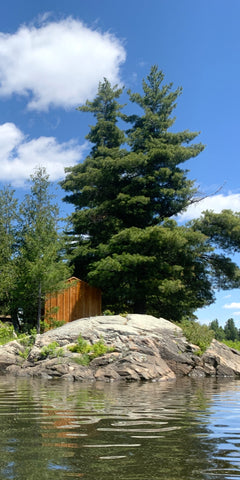
 The story began in 2016, when I spotted this pine tree with its top lopped off by a wind storm.
 That same month, we saw bald eagles quite often during our boat cruises on Lake of the Woods. The eagles would perch on tall trees, looking for their next meal. I managed to photograph this one way up in a dead pine tree.


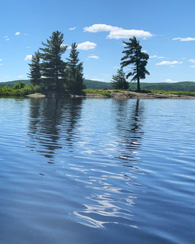
 The marvellous Pebble Beach in the town of Marathon on Lake Superior has inspired yet another painting.
 The scene never looks the same twice, with wind and sunlight affecting the behaviour of the waves and the colours of water and rock.
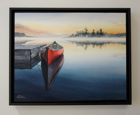
 On the subject of multiple interpretations of a given scene, here is my third painting of this northern lake with dock and red canoe.
 Thank you to Pamela Weston for permission to use her reference photo (shown here) in the creation of my artwork.
 I so enjoyed the challenges of this subject that I decided to paint a second version with a different colour palette.


